
Apple’s new flagship, iPhone X is here. Here are some do’s, don'ts and inspiration when designing for it.
At BBH Stockholm it's always important to stay one step ahead and take a deep look at new mobile products. When working with digital projects and mobile solutions for customers such as Volvo, Tesco Bank and Travelex we always keep in mind how the app interacts with, and utilizes, new products as the iPhone X.
There have already been dozens of articles addressing The Notch, the new screen size etc. – so we’re just going to mention the most important stuff briefly. If you want to go into details, you can read Apple’s Human Interface Guidelines.
The NotchThe most discussed and ridiculed “feature” with iPhone X. Whether you’re a fan or not, there are some things to keep in mind here. Although Apple wants us to embrace it (don’t hide it), they also don’t want you to use it as a part of your UI (second image below). What’s interesting is that after a month of using the new iPhone we don’t really think about the notch being there, which also means it doesn’t bother us. With that in mind, if you do follow the do’s and don'ts of the notch, the user experience will be improved.
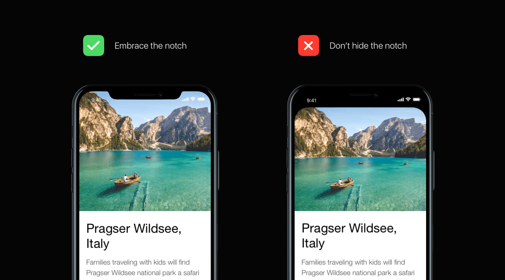 Example on how you should go about treating the notch
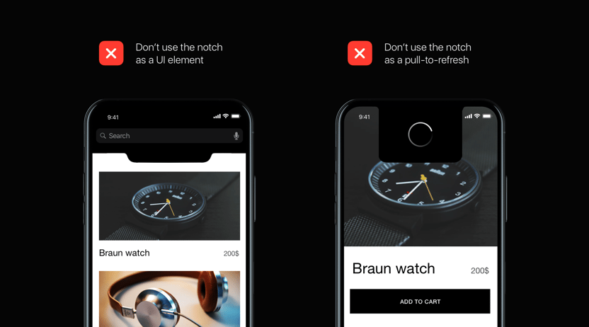
Embrace the notch, but don't use it as a part of your UI
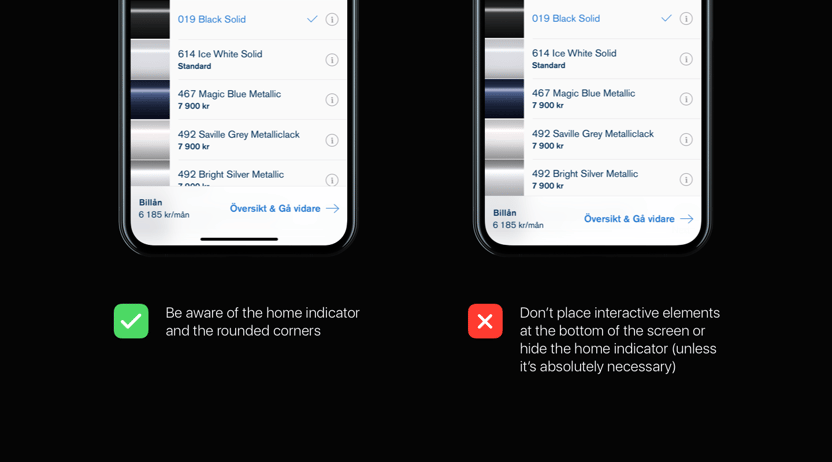
Rounded corners and home indicator
Another big change with the new iPhone is the lack of a physical home button. Instead, Apple has replaced it with a home indicator at the bottom of the screen – from where you swipe up to get to your home screen. Since the iPhone X is more gesture-oriented, you need to think about where you place your interactive elements.
Inspiration
Enough about do’s and don’ts, let’s have a look at some inspiration on how to actually embrace the notch, taking advantage of the new rounder look, and using the space at the bottom.


Conclusion
Since the new iPhone has only been out and in people's hands for about a month, we can only speculate on future trends, but considering what’s been trending in the design community and what's been shown from Apple so far we think we will see the rise of
- Rounder UIs to match the screen's roundness
With the round shape of the screen, we will start seeing more interfaces that are inspired by the round shape - Big and bold
With the roundness of the all-new iPhone X, typography is not only going to get larger but also thicker. Bolder typography works really well with round shapes, and since Apple themselves are moving in this direction with the style of iOS11, we will start seeing larger typography in general in apps. - Brighter and bolder colours
iPhone X is the first OLED screen from Apple and will feature more accurate, stunning and true colours. With this in mind, we will start seeing people experiment more with colour options. - Taking advantage of the edge to edge screen
As the bezels get smaller and the screen gets bigger, we might see more dramatic and fullscreen imagery that take advantage of the all-screen phone. This is a small effort in upping your app's design-game. - Towards a gesture-driven future
Gestures are a highly sensitive topic in the UX world. They make a UI look less cluttered, but that cleanliness usually comes at a high price: designers rely on users to figure out how these gestures work. However, as the minimalistic era of design is coming to an end and new trends start to pop up we will see trends like fluid layouts that let you swipe to add to cart and have helpful animations guiding the user where to look and how to engage the UI, it might actually not sound that crazy heading towards a more gesture-driven UI. Also, now that gestures have become an essential part of the core interaction of an operating system that’s used by millions, we will probably see way more interactions like these in the future. How cool wouldn’t it be if you could swipe from left using 3d touch to open the notification centre or swipe from right using 3d touch to open the control centre? - Death of the hamburger menu
The hamburger’s whereabouts have been discussed for quite some time now, but the increased phone sizes have fueled the discussion even more. They are hard to reach, and users can’t get a glance at what’s within the app. With the even taller iPhone X, they’re going to be even harder to reach. Hence the tab bar is the more viable option out of a user experience point of view.
Adapting existing apps
There are some tweaks and pixel-pushing that has to be done with existing apps, but most will run fine. The most noticeable tweaks are the navigation bar and tab bar which are taller than before. iPhone X also requires @3x assets because of the higher pixel density. The existing apps will automatically be centered on the display, while rendering the top and bottom as black. This doesn’t look ideal, but it won’t be totally messed up.
Final thoughts
So all in all, we are really looking forward to the future of phones and the possibilities that come with them. Who knows, in a few years when all phones look the same with no home button, and we have gotten used to the idea of swiping instead of pressing, the home indicator might even also be removed, and we’ll see truly all screen phones. Another great step in the direction of futuristic phones.
Imagine voice recognition/AI getting so powerful and smart that you can solely rely on it when navigating your phone? No buttons, no gestures. Just your voice. While we don’t think that it would be the prefered way – or that gestures and buttons will go away completely – it’s an interesting thought. It all comes down to habits and the stigma around talking to your phone in public areas. It’s slowly getting more and more acceptable, but there’s still time needed for it to be 100% socially ok.
For now we’re hard at work developing iPhone X adoptions on many of our clients apps, making sure to always deliver the best user experience possible.
